In front of the mirror, under the harsh lighting of a dressing room, there is a familiar hesitation: The clothes fit, the silhouette works — so why does something still feel off? For many, the answer lies not in the cut or construction of a garment, but in something less apparent. As explored in NoLabels’ discussion of color theory in fashion, clothing is not simply about form, but about how color interacts with the body to create — or disrupt — visual harmony. What may seem like a minor detail can determine whether an outfit feels cohesive or disjointed.
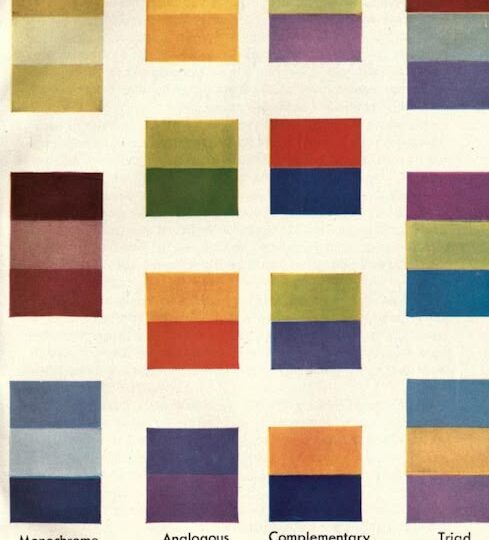
Color theory examines how colors relate to one another to create aesthetically pleasing combinations. The color wheel is a common tool for mixing and matching hues that work well together. Complementary colors can create contrast and visual interest, while analogous colors produce a more cohesive, monochromatic effect. At its core, color theory is about understanding the emotions different hues evoke and using them to visually express a desired mood — an idea often referred to as the psychology of color in fashion.
Insights from Zuni Sportswear’s analysis of color psychology suggest that color choices can shape how individuals are perceived. Color influences how people interpret others, as well as environments and situations. Warmer hues tend to draw attention: Red can signal passion or strength, while orange can show enthusiasm and warmth. Yellow is often associated with optimism and happiness. Cooler tones — such as blue, green and purple — typically have a calming effect. Blue can communicate trust and stability, green suggests balance and growth and purple evokes creativity and introspection.
Neutrals, including black, white and brown, often project confidence, simplicity and versatility. Black can signal authority or professionalism, while white conveys clarity and openness. Beige and brown tones tend to feel grounded and understated, making them easy to incorporate across styles.
Color theory also varies by skin tone. Certain shades can enhance natural features, making skin appear more radiant and eyes more vibrant. Warmer skin tones are complemented by amber, gold, orange and other earthy hues, as well as richer shades like olive or plum. Cooler skin tones tend to suit bright blues, emeralds and deep purples. Neutral undertones typically allow for greater flexibility across the color spectrum. Some shades — including white, soft pink, deep purple and black — are widely considered flattering across a range of undertones.
Applying color theory to a wardrobe is a great way to upgrade personal style. Starting with a neutral base — such as white, cream, gray or navy — creates a strong foundation. Adding a single accent color, like indigo, saffron or emerald, can provide visual focus. Equally important is considering mood and intention. Color theory is not only what looks good, but also about how clothing makes the wearer feel. In “Colour Theory in Fashion: The Science Behind Style, Emotion, and Mood,” author Stephanie Rumble discusses “dopamine dressing,” the practice of wearing colors that evoke happiness and confidence.
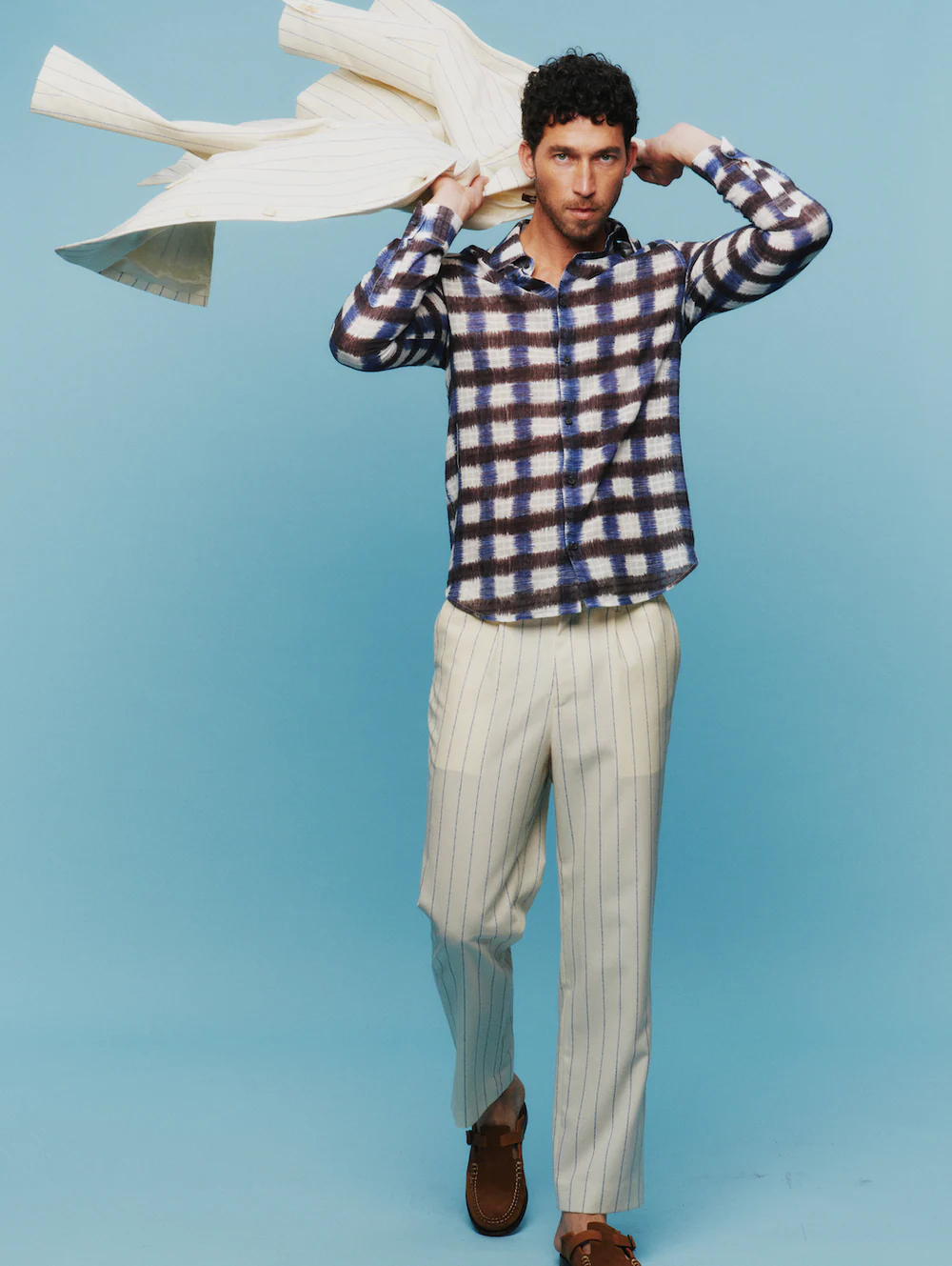
Some of fashion’s most recognizable figures demonstrate a consistent understanding of color theory. Zoë Kravitz, for example, often gravitates toward warm-toned neutrals — browns, golds and muted earth tones — that complement her complexion and reinforce a cohesive visual aesthetic. Similarly, Courteney Cox’s portrayal of Monica Geller in early seasons of “Friends” featured a palette of bright reds, baby blues and neutrals that aligned with her undertones, creating a polished look even in simple outfits. These examples illustrate how color can subtly but powerfully enhance both appearance and self-perception.
Color is an immediate yet often overlooked way to shape perception, functioning as both expression and strategy. It influences not only how an outfit is seen, but how the person wearing it is understood. In a space where appearance carries meaning, the difference between blending in and standing out may come down to something as simple — and as nuanced — as color.
- More than Matching - May 8, 2026